Wayfinding signage systems are strategic tools for visual communication that assist people in navigating and determining their way in physical spaces such as building establishments, educational institutions, streets, and transport stations. In order to offer individuals concise and easily understood information about their surroundings and swiftly guide them to their intended destinations, these systems make use of signs, symbols, and other visual signals. By directing people to their respective locations, wayfinding signs aim to eliminate confusion, enhance user experience, and increase safety.
ELEMENTS OF SUCCESSFUL WAYFINDING SIGNAGE SYSTEMS
The essential elements of a navigation signage system include the following:
• Strategic Placement and Visibility
Place signage that is both clear and noticeable close to the facility’s primary entrances. The business logo, directional guides, and basic details about various departments or areas could be included on such signs. Ensure that directional signage or information kiosks are available in the reception areas to direct guests to different offices.
Conference rooms and offices should be clearly marked with interior wayfinding signage to help staff members and visitors find particular rooms or meeting spaces. Floor and wall graphics could also be used to incorporate wayfinding information into the structure’s layout and design. These can act as unobtrusive but powerful visual cues to direct individuals in the right direction.
Ensure that the company’s outdoor signage and directional signs are visible from the road or the main entrance. Place navigation signs in the parking area to point people toward the primary entry point and to clearly indicate reserved parking spaces, accessible parking, etc.
• Clear and Consistent Messaging
Refrain from using complicated or jargon-filled language. Use simple, easy-to-understand words that convey the idea effectively. Ensure readability by using fonts and font sizes that are legible from a distance. To improve legibility, choose a strong contrast between text and background.
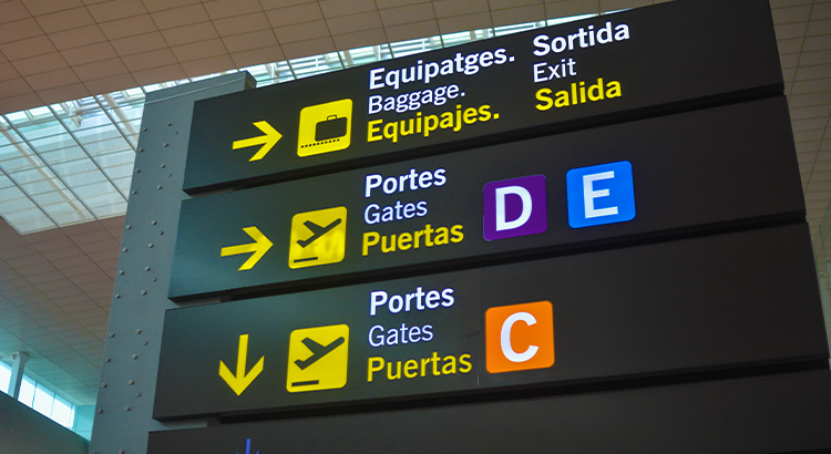
Throughout the signage system, use consistent arrow designs to indicate directions. This allows people to comprehend the meaning of the arrows naturally and follow them without confusion. If your wayfinding signage design uses colour coding to distinguish different sections or levels, make sure the colours are consistent, and the meanings are clear to users. Incorporate your company’s branding aspects into the signage design while remaining consistent with your overall branding guidelines.
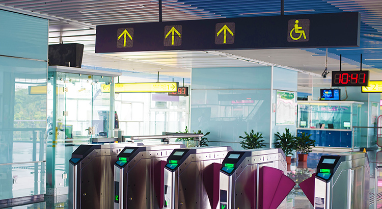
Use universally identifiable symbols and graphics to supplement the text, especially for important utilities such as restrooms, elevators, staircases, and exits. Illustrations may communicate information quickly, even across language difficulties.
Each wayfinding design should be focused on delivering specific information about the immediate location. Avoid cluttering signage with extraneous details that could mislead users. Conduct usability testing with people who are unfamiliar with the premises to assess the clarity of the wayfinding signage. Take note of any confusion or queries raised during testing and make any necessary revisions.
• Intuitive Layout and Design
An intuitive signage layout guarantees that visitors, customers, and employees can easily understand the information offered and navigate the premises with ease. Organize the information on the signs in order of importance, with the most important information shown prominently and less important facts displayed below. This enables consumers to prioritize the information they seek.
Arrange the placement of signs in a logical sequence that follows the regular traffic flow. Signs should guide users from a particular choice towards the next in a pattern that makes sense. Group identical data together. For example, in big buildings with several departments, cluster way finding signage for different departments in close proximity. Utilize colour and font-weight to establish a visual hierarchy that attracts attention to important information and guides viewers through the sign’s content. Use white space effectively to reduce clutter and offer visual balance on signs. A well-balanced design improves readability and user comprehension. Keep decorative elements and extraneous graphics to a minimum since they may distract from the primary objective of the sign—clear navigation and information.
• Proper Signage Sizing
The distance from which your navigation signs will be observed is the most crucial consideration when deciding their size. The size of the signs should be sufficient for easy reading from the intended viewing distance. The signs’ text should be clear enough to read without putting too much strain on the viewer’s eyes.
Select simple and straightforward fonts in the appropriate sizes. Take into account the intended location for signage placement. It might need to be bigger to make up for the extra distance from the viewer if it’s placed much above eye level. It may be necessary to use larger text and images on the signage if it is placed in locations with poor lighting or inclement weather.
Using symbols and pictograms can improve navigation and cut down on the amount of text that is required. Make sure that these symbols are large enough to be seen clearly. Before putting the finishing touches on the signs, think about testing them with a focus group or getting user feedback. This can aid in locating any potential visibility or legibility concerns. When it comes to the size of business signage, keep in mind that there is no one size fits all option. There might be particular needs for each situation and region. It is preferable to collaborate with a qualified signage designer/ installer or wayfinding specialist who can evaluate the particular requirements of your company and offer suitable signage solutions.
WAYFINDING INTEGRATION WITH ARCHITECTURE
• Adaptability and Scalability
Modular, movable parts that can be modified, removed, or altered should be used when designing wayfinding systems. When new locations are added or when the arrangement of an area changes, this modularity enables adaptability.
Wayfinding architecture can be accessible and readily available to people of all ages and abilities by adhering to universal design principles. This entails taking into account the requirements of those with disabilities and making sure that the directional and wayfinding signage is clear and practical to everyone.
Planning for future development and expansion is a necessary part of scalability. The potential growth in destinations, foot traffic, and complexity must all be taken into account when building a wayfinding signage system.
Using flexible signage options, such as digital displays, can make updating and changing signs easier than with static signage. Digital signs can be used to display dynamic information based on current conditions and can be remotely updated. Establishing a uniform design language for all navigation components on a building or campus ensures coherence and makes it simpler for users to comprehend the system as it grows or changes.
To increase versatility and scalability, wayfinding architecture can make use of a variety of technologies, including mobile apps, interactive kiosks, and augmented reality. These technologies can offer tailored navigation support and real-time updates.
Take into account the surroundings and how they might alter over time. For instance, outdoor wayfinding systems should consider the impacts of weathering and make plans for repair or replacement as necessary. A well-maintained navigation system will continue to be intuitive and functional. The system’s adaptability and lifespan are guaranteed by embracing maintenance planning in the initial design phase.
• User Testing and Iteration
Establish specific objectives and targets for the navigation system before you begin user testing. Establish the goals for users and the issues the design is intended to address. Determine the various user groups that will benefit from the wayfinding system. This may apply to customers, staff members, those with disabilities, and others. Every group could have particular demands and preferences.
Create models for the wayfinding system’s signs, maps, and digital user interfaces. These prototypes could be real-world models, virtual simulations, or engaging activities. Invite representative users from each identified group to test the prototypes as part of usability testing. Observe how they use the wayfinding components and take note of any problems or confusion they run into.
During usability testing, invite people to provide their opinions. Ask them open-ended inquiries about their opinions, problems, and ideas for fixing issues. Iterate on the wayfinding system’s design based on user testing’s input and observations. Implement adjustments and upgrades to deal with the problems you’ve noticed. After making design modifications, run more iterations of user testing to confirm the success of the adjustments. The navigation system can be enhanced through iterative testing to satisfy user demands better.
• Adequate Signage Density: Ensuring Sufficient Coverage
In order to give consumers clear and timely instructions, signage density refers to the proper placement and quantity of signs. While it’s important to have sufficient signage to direct users, stuffing the space with signage can be overwhelming and counterproductive. Strike a balance by giving the necessary information while avoiding congestion.
Increase the signpost density in places with complicated junctions or crossroads to reduce uncertainty and aid users in securely navigating the area.
Use constant navigation signals to guide you around the area. This can involve using uniform signpost placement, colours, symbols, and design elements. Users can become accustomed to and gain confidence in the navigation system by using a consistent approach.
Verify that each sign is readable and visible at the distance from which it is intended to be viewed. For signs to stand out from the background, they should be large enough, have legible fonts, and employ complementary colours. Particularly in large or complex environments, think about employing layered signs. At key areas for decision-making, give consumers broad directional information; as they approach their objective, give them more specific information.
Use both vertical and horizontal surfaces for signage placement. While horizontal signs are simpler to read when people are nearby, vertical signs are more apparent from a distance.
BRANDBOY – COMMITTED LEADER IN TRANSFORMING SPACES
If you’re looking for reputable signage and fitout company that can deliver high-quality signage services with a complete project management solution, Brandboy Australia is an excellent choice. Our Brandboy team has a broad experience in signage projects in multi-site companies for a wide range of industries in Australia, including retail, commercial, corporate, automotive, public transportation, industrial, entertainment, and medical.
We offer a variety of signage solutions, including wayfinding, experiential architecture, graphic walls, indoor and outdoor digital signage, office signage, custom signs, and AR/VR displays. In order to improve customer satisfaction and boost work efficiency, we can also incorporate digital transformation into your company. Our staff ensures that any work will have a long-term positive impact on your business and enhance the value of your assets.
We also specialize in fitout and refurbishment works such as flooring, ceiling, painting, carpentry works, glass partitioning, bathroom, reception and lobbies, electrical and data, joineries, concrete work, landscaping, gardening, and other related services. Our services involve site audits across all stores and offices, budget and cost analysis, council approval, digital transformation projects, procurement and maintenance management, completion of all trades, remedial works, compliance, and end-to-end project management.
If you need expert and professional assistance with your next signage projects, you can reach us at 0451 816 788 or click here to fill out our contact form, and we’ll reach out to you as soon as possible!